The data explorer is where you define the report you want. It is split between account reports and resource access reports. Most reports use the same core elements and some have additional options. Having a play with the controls won't do any harm, although very large reports may take some time to load.
Any report you generate can be saved or scheduled. You can also download the data.
It is possible to generate reports that are both large and complex. When this happens, you may need to save the report to your computer to work with it.
Dimensions
Dimensions are about how you want to break down your data.
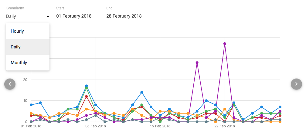
Granularity
This refers to the smallest time that differences are measured over. Most reports will offer day or month granularity.
Some reports offer hourly granularity, depending the subject and the age of the data. Because hourly reports have 24 times as many data points, their date range is limited to two weeks.
Start and end dates
These are inclusive which means 1st of the month to 1st of the month can give you more than you might expect.
By necessity, dates and times are in UTC.
Breakdown
This varies by report type.
For resource or usage reports you can break the data down by any reportable attribute you have added to your schema. As these are set at the domain level, you can include these in multi-organisation reports. Group and permission set options are available only for single-organisation reports.
For the account totals report you can break it down by type, status or activity events.
For account and resource usage you can break reports down by any reportable attribute.
Scope
This allows you to see results over the current organisation or all the organisations below you. Permission set or Group breakdowns do not have an all organisations option as they are specific to one organisation.
Series
Series define the kind of data you want to show, such as account types or events. You can display up to nine series in the timeline and chart views.
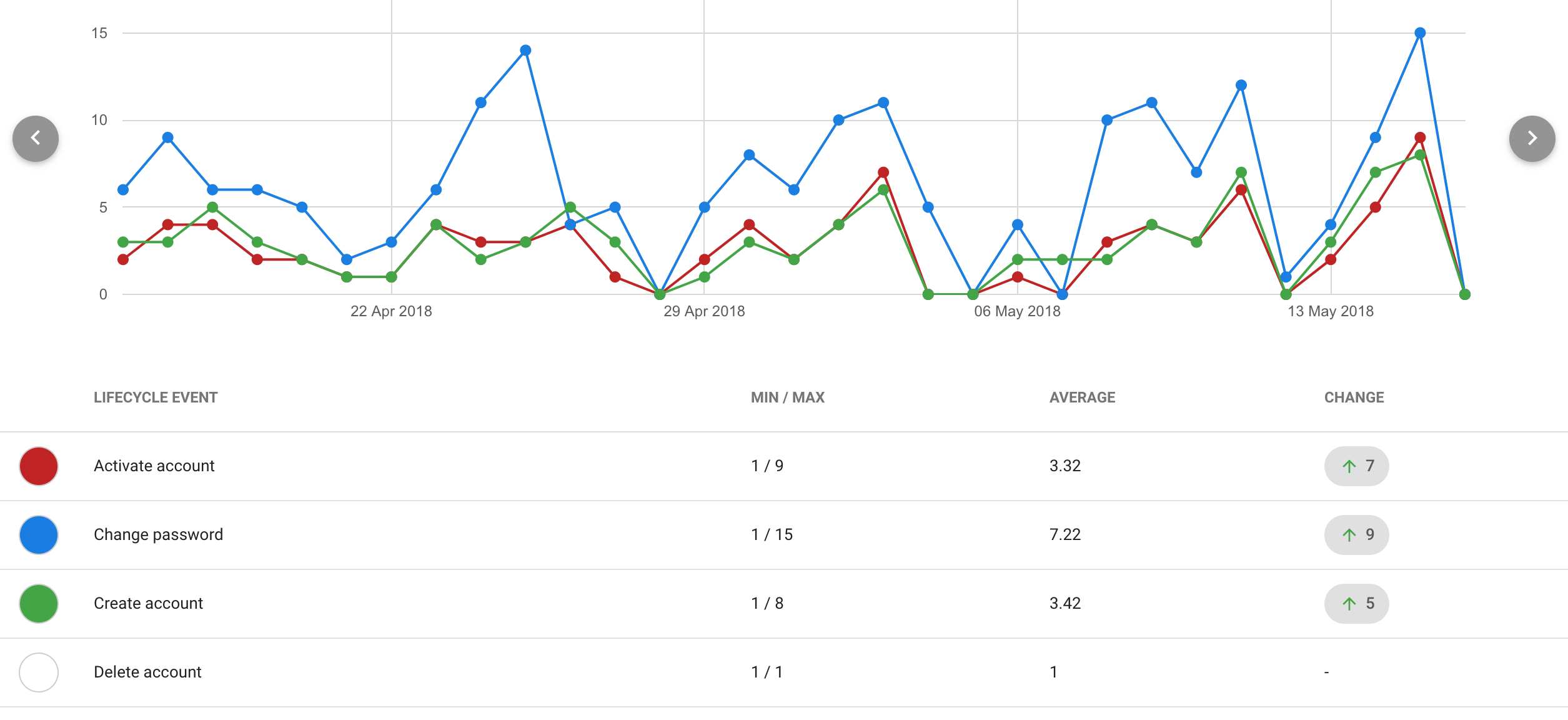
When you select one or more series, those selections will stick for that report. For example, on an access report by attribute, your selected series will stick when you change resources so long as at least one of the selected series has values. Selected series will be reset to the default when you change to a different report.
Min / Max
This refers to the lowest and highest number recorded during the period at the selected granularity.
Average
The mean value over the period.
Total and Unique
Where the unique data point appears it means the number of unique (distinct) accounts that generated them. For example there may be 3000 total authentications by 2300 unique users.
Unique only appears on authentication reports at the moment.
Change
The difference between the values on the first and last dates of the period (that have data).
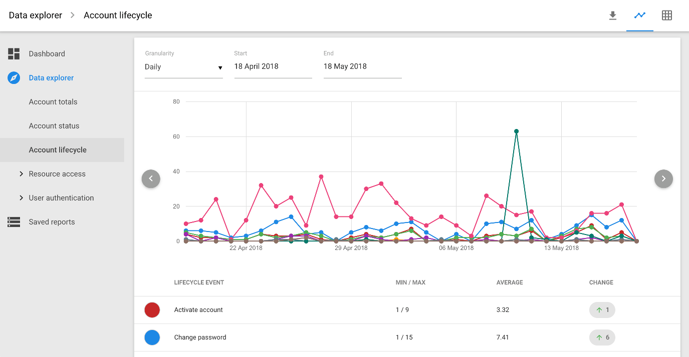
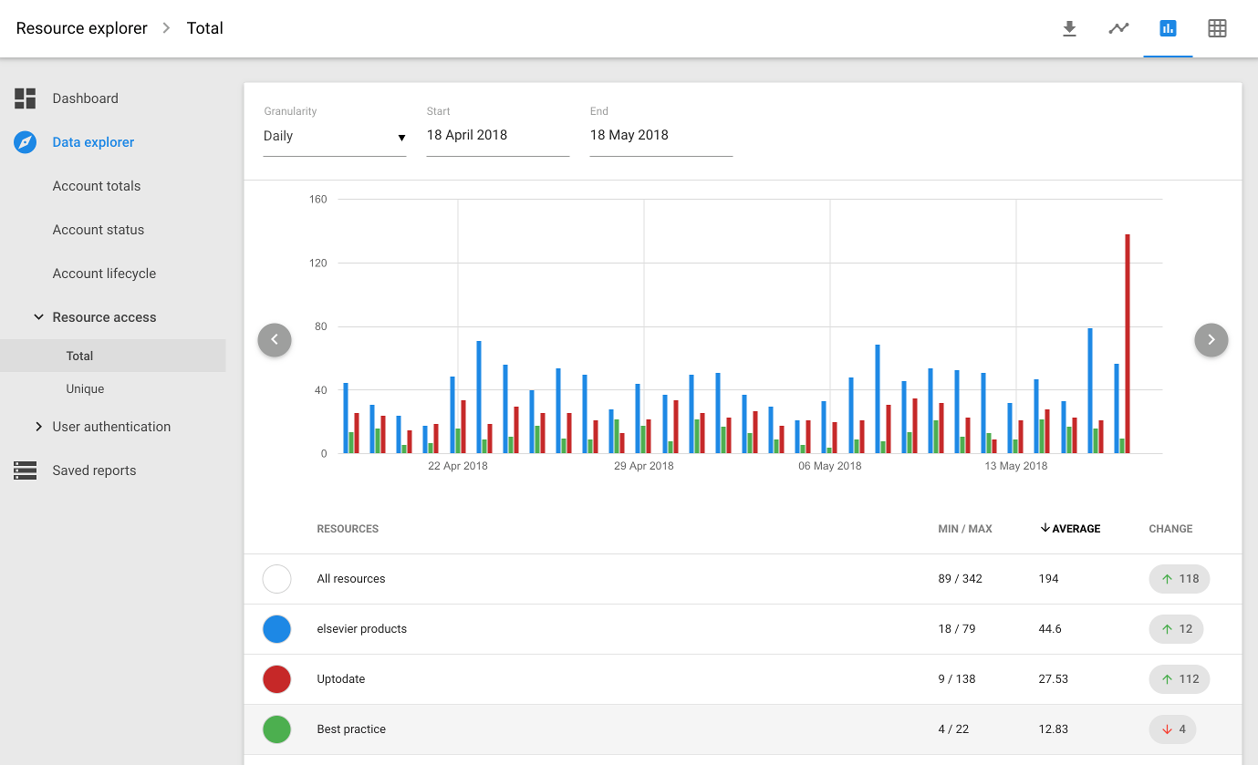
Views
The available views can also vary by report type
![]()
Shows a line graph and data table from which you can select series to display on the graph.
![]()
View as a bar chart.
![]()
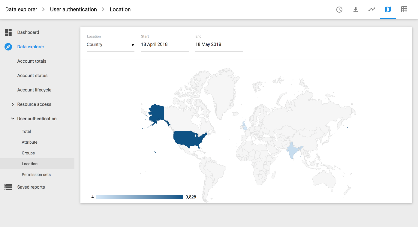
Only available for reports on countries. The same map appears as part of the dashboard.
Anything to watch out for?
The network and country breakdowns on the Accounts > Usage report are based on the IP address the user was seen at when the sign-in took place. If you see 'Unknown' on these reports, it means that the IP address didn't resolve to a network name (Network breakdown) or couldn't be identified by the geo-ip database we use (Country breakdown). Neither signifies that anything naughty is going on.